Mechanics’ Hall Rebrand
12.13.2022


Scope:
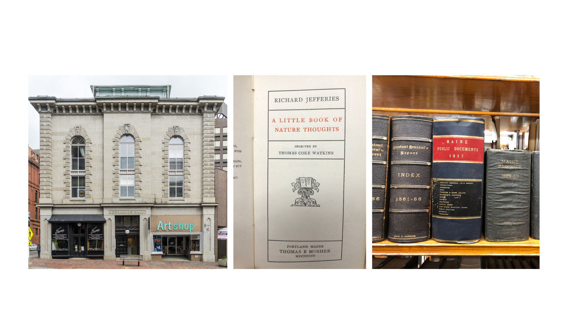
This is a project that came to my Professional Studio class at Maine College of Art & Design through my professor, Amy Parker of Woods Creative.Mechanics’ Hall in Portland Maine is a nationally significant historical building, a center for the arts, and a library in one. Celebrating the many evolving aspects of their identity, they requested rebrand proposals from my classmates and me.
I worked on a team with Rachel Gilbert to design and refine a new identity. During our third meeting with stakeholders from Mechanics’ Hall, our proposal was awarded best in show, with the intent to further work with Mechanics’ Hall on implementation.
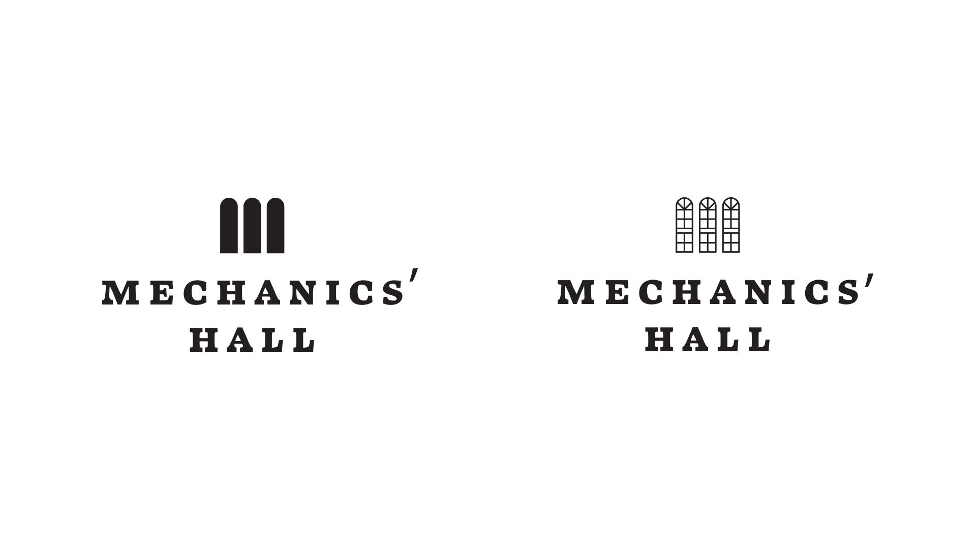
About the logo:
Inspired by the windows on the building and the architectural theme of arches, the three arches above the text are used to make an “M” like shape.The type is inspired by classical book typography and Jan Tschichold’s “The Form of the Book.” The typeface is Swear by Ohno Type Co.
The combination of the abstracted arches and the classical type creates a timeless feeling, referencing both historical and contemporary designs.
About the touchpoints:
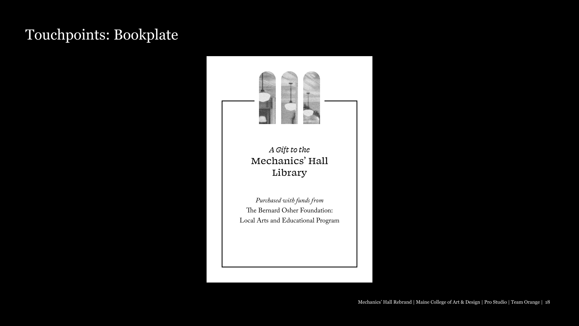
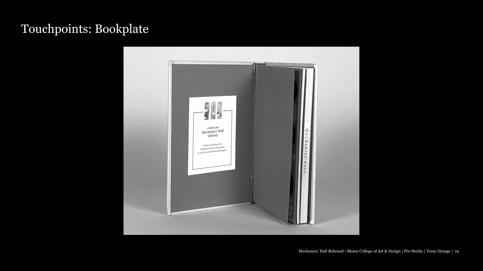
Leaning into the classical typography within the logo, most text is centered with a significant rag.The colors are primarily black and white as a reference to the current branding, and to create a thoughtful subtlety to collateral.
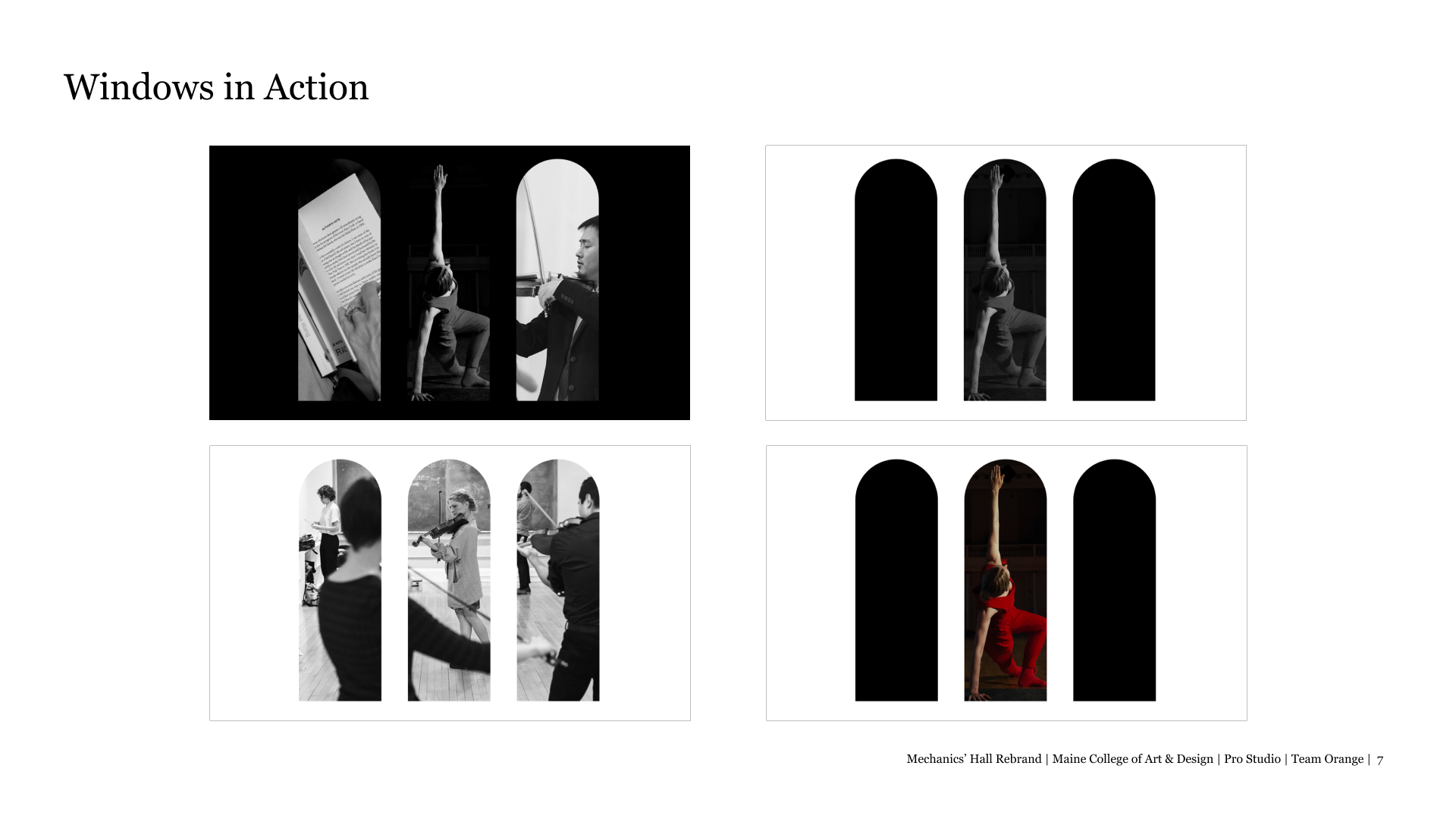
When appropriate, the window shapes are used as a way to show pictures. This creates an illusion of looking into the windows to see what is going on in the building.